Since we had the kids’ bedrooms painted I have had a little bit of designer’s block for how to move forward. The fresh coat of paint makes the rooms look so much cleaner but it’s hard to want to nail holes in perfect walls. It makes me think I have to have everything planned before I do anything, so I’m psyching myself out a bit and I’m not actually doing anything.
I thought maybe if I see where I’ve come from, I’d feel better about the nursery progress we are making and maybe come up with some ideas for where we should be going.
This is how Kate’s nursery looked in our old house:
I embraced having two girls and decided to paint the bedroom purple and I really did love the colour! (it’s Martha Stewart’s Phlox). Her old bedroom was also the guest bedroom so it had a queen size bed in it. It made the room really cramped, but it was really convenient to be able to sleep in there when she was a newborn. We moved before we had the opportunity to get rid of the bed and set up a real nursery for her, so it was never more than a few random things thrown together, but it was cute in its own quirky way.
When we moved into our new house, this is what her bedroom looked like for the first month or so, and I actually didn’t think the layout was too bad:
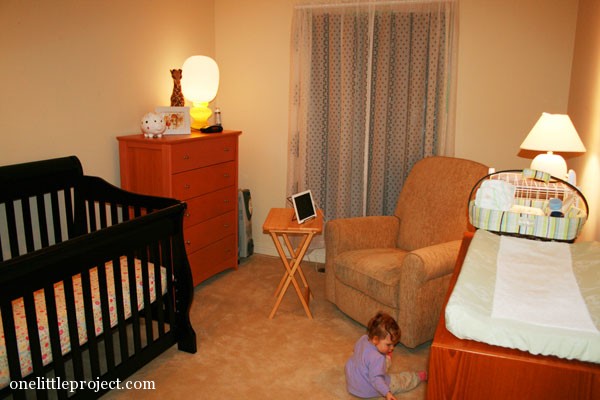
The house came with old lady lace curtains and we didn’t have blinds so what you see behind the curtains is a big black garbage bag blocking out the window. Classy, don’t you think? The change table was originally right when you walked in the door, so the whole room looked messy any time the change table wasn’t kept perfectly organized (and who has time to perfectly line up diapers in a change caddy?)
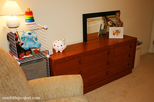
So when Leah got her new dresser, we brought her old dresser into Kate’s room, and switched the change table to the opposite side of the room:
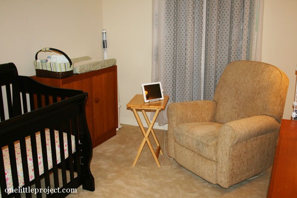
You didn’t see the change table from the hallway anymore, but it became really cramped and it was awkward to actually get to the change table.
After the painter left, and the room was relatively empty with the new Gray Owl colour by Benjamin Moore, I figured it was a perfect time to test the crib location to try to get a feel for the best room layout. (Rather than arranging it with felt pieces like I did with Leah’s bedroom). At least the crib is light enough that I can move it around by myself.
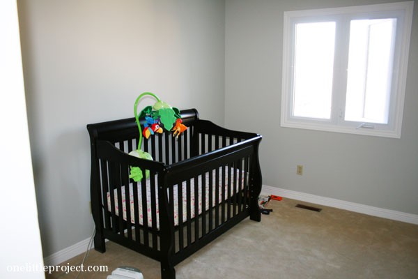
Here’s the crib on the wall where it had been since we moved in:
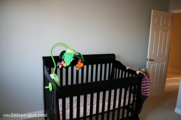
Here’s the crib by the door. It was awkward to have to have to walk around it when you walked in:
I didn’t mind the crib right next to the window, but it meant there wouldn’t be room for furniture beside it, which wouldn’t work with what we need:
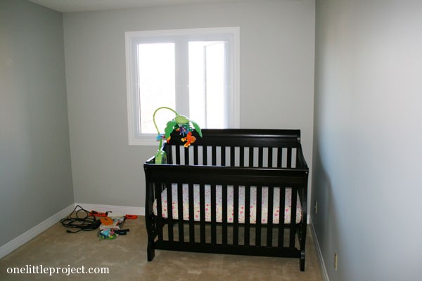
And putting the crib in front of the window made the room feel tiny:
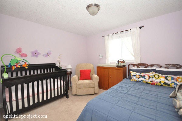
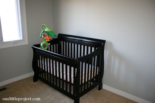
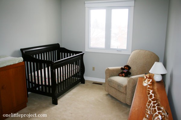
We settled on this layout, where the crib is in the corner with the window, and somehow it really opens up the room! At least now the open space is right when you walk in, which really makes the bedroom feel bigger. This is an example of how sometimes trial and error is the best way to set up the furniture in a room!
So what do you think? It’s done, right? (just kidding) There are so many more things I want to do, but I don’t know where to start. All the walls are blank so I need to figure out curtains and wall art. I also need to figure out if I can find updated hardware for the teak furniture. Toy storage is a bit of an issue too because there is pretty much no space for toys without making it cramped.
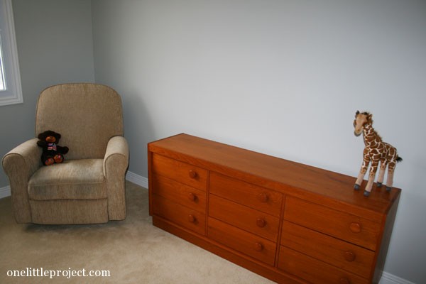
I think it looks better than what we started with, so we are making some good nursery progress. I love the furniture layout. I just need to decide on a colour scheme to run with for all of the accessories. And now that we actually have blinds instead of a garbage bag, the room actually gets to see daylight! Hopefully I finish her nursery before she grows out of her crib!
Source : onelittleproject.com
Read more...


Post a Comment
Post a Comment